Choose Your Tastes
In preparation for the grand opening of
the preference-based restaurant recommendation feed,
I led the restaurant preference collection feature, engaging 600,000 users and collecting 8 million preferences in just one month.
background
Naver, Korea’s leading search engine, was preparing to launch a feature that recommends restaurants based on individual preferences.
To achieve this, it was essential to gather preference data from users. However, relying solely on search, save, and visit histories resulted in insufficient data, leading to a cold start problem—making it difficult to generate accurate recommendations due to the lack of data on new users or items.
As the launch of the preference feed approached, we needed to collect extensive user preferences while also effectively promoting the upcoming feature.
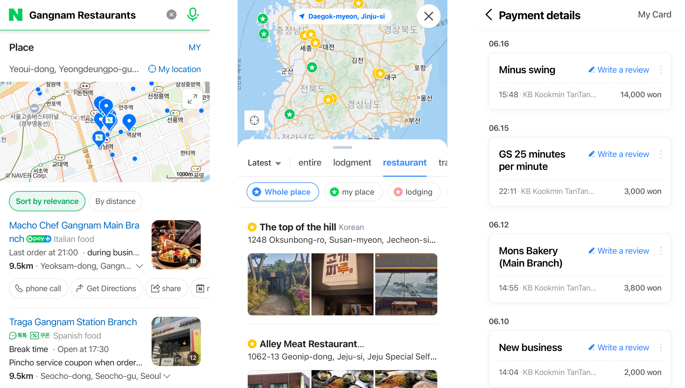
User history is collected through various routes to gather preferences.
mission
The mission for this project was to collect individual preferences for about a month before launching the preference feed.
Our missions were to:
1. Collect preferences from users.
2. Build anticipation for the new feature among users.
3. Assess feature reception and establish future plans.
my role
From November 2020 to January 2021, I led the design of the preference collection experience, collaborating with a backend developer, a frontend developer, and another designer.
Additionally, I independently managed the planning of the collection event, as well as the execution and user analysis of the survey for approximately 40,000 participants.
Approach
Defining the Data
Collection Strategy
We knew that asking users about their restaurant experiences would provide accurate data. However, to gather more data quickly, we opted to show restaurant photos and ask users if they matched their tastes.
The goal was to make the process simple and enjoyable. We wanted users to easily engage with the new feature, casually browsing photos and selecting what appealed to them.
To achieve this, we quickly devised two methods.
initial design
Two initial design drafts
The first approach allowed users to select restaurant photos that matched their taste from an image tile, while the second approach, similar to the Tinder app, let users easily swipe to indicate whether a restaurant suited their preferences.

In-company usability testing
We tested these two approaches with nearly 100 internal team members. The goal was to identify the preferred method and further refine the details within that approach.
Grid Layout
- Advantages:
Allows users to view multiple restaurants at once.
Enables selecting multiple options from a single screen. - Drawbacks:
Difficult to choose based on a photo alone without additional information.
Tinder-style Approach
- Advantages:
Large images provide comprehensive information (e.g., restaurant name and menu).
Aids in decision-making with detailed visuals. - Drawbacks:
Progressing through choices one at a time makes the task feel lengthy.
Repeatedly encountering uninteresting locations can be frustrating.
Discover
Early Insights from the test
We focused on the drawbacks our colleagues identified during testing, uncovered several issues that needed resolution, and began considering solutions.
Can a Single Photo
Determine Your Taste in Restaurants?
This method streamlined the process of selecting preferences but lacked the depth required for informed decisions. We realized that when users know their choices will lead to personalized recommendations, they tend to be more careful. However, the limited information provided made it difficult for them to do so.
To address this, we kept the grid format but increased image size by shifting from a three-column to a two-column layout. Additionally, we added a clickable option for more details, offering essential restaurant information and more review photos to help users make well-rounded decisions.

Choosing Is Hard
When All Photos Look Similar
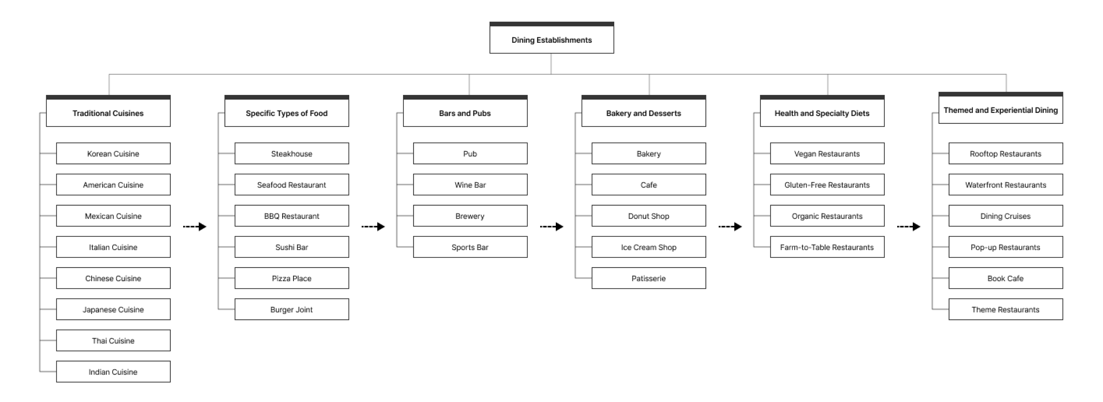
It was important that the continuously displayed photos should not look too similar to each other. If similar photos are repeated, it becomes difficult to choose, and if a series of non-preferred options appear, users might leave.
To address this, we categorized restaurant types and arranged the photo order by rotating categories. For example, an Italian restaurant is followed by Korean cuisine, barbecue, seafood, bars, etc.
This sorting method ensured each photo stood out, making selection easier for users.
Isn't it a Preference for Photos,
Not Food?
I began to question whether selecting restaurants based on photos reflected a preference for the images rather than the actual restaurants. For example, a meat lover might skip a restaurant if the photos show unappealing dishes. This led us to realize that, without prior knowledge of a restaurant, choices were often based on photo appeal rather than true food preferences.
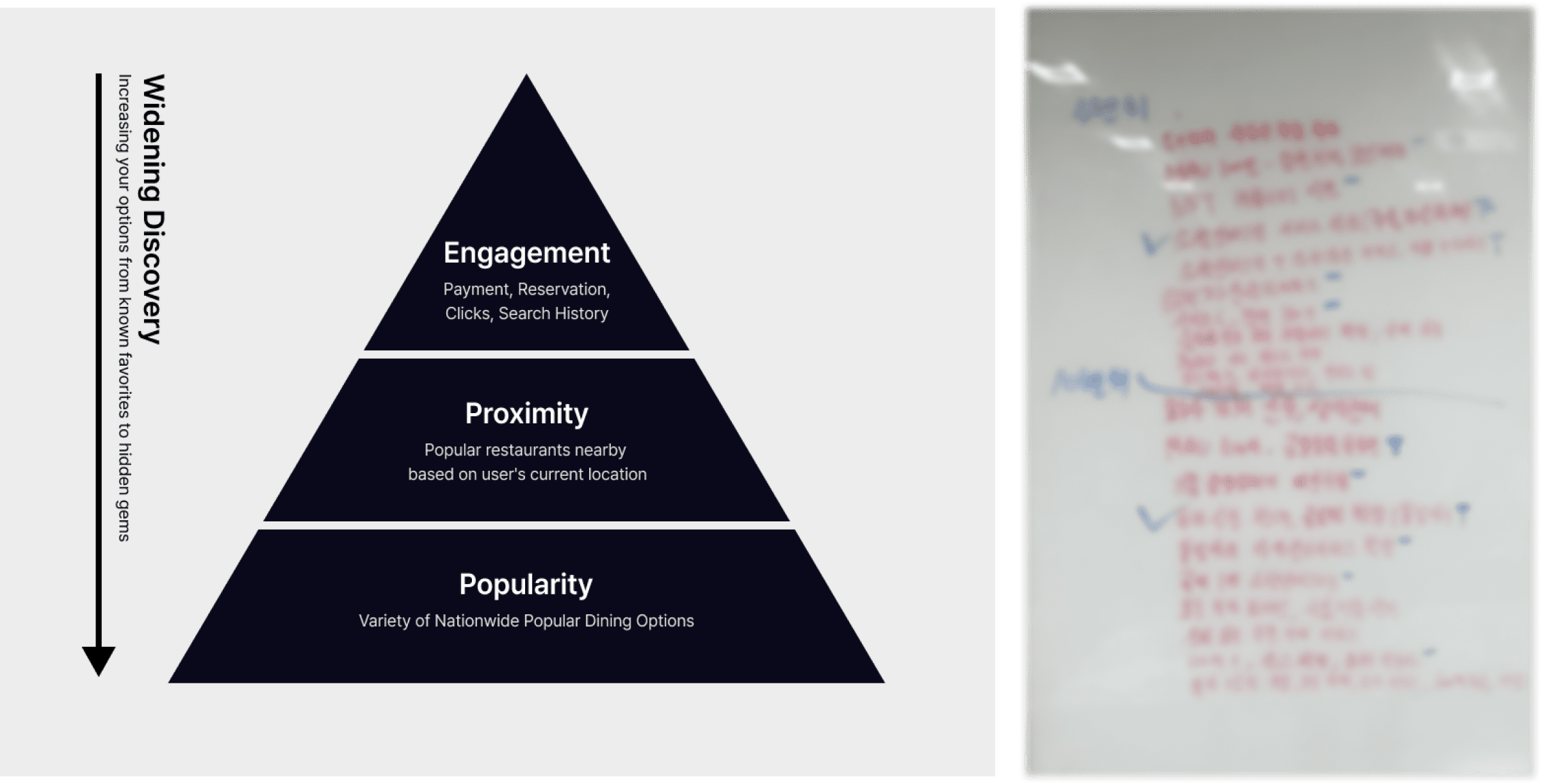
To ensure choices reflected genuine preferences, we refined our approach by displaying restaurants users were likely to recognize from past interactions.
- Priority 1: Display images of restaurants the user may recognize, using data from previous visits, reservations, clicks, searches, and transactions.
- Priority 2: Present a variety of reputable restaurants near the user’s current location, cycling through popular options in the area.
Implementation
Planning a User Engagement Event
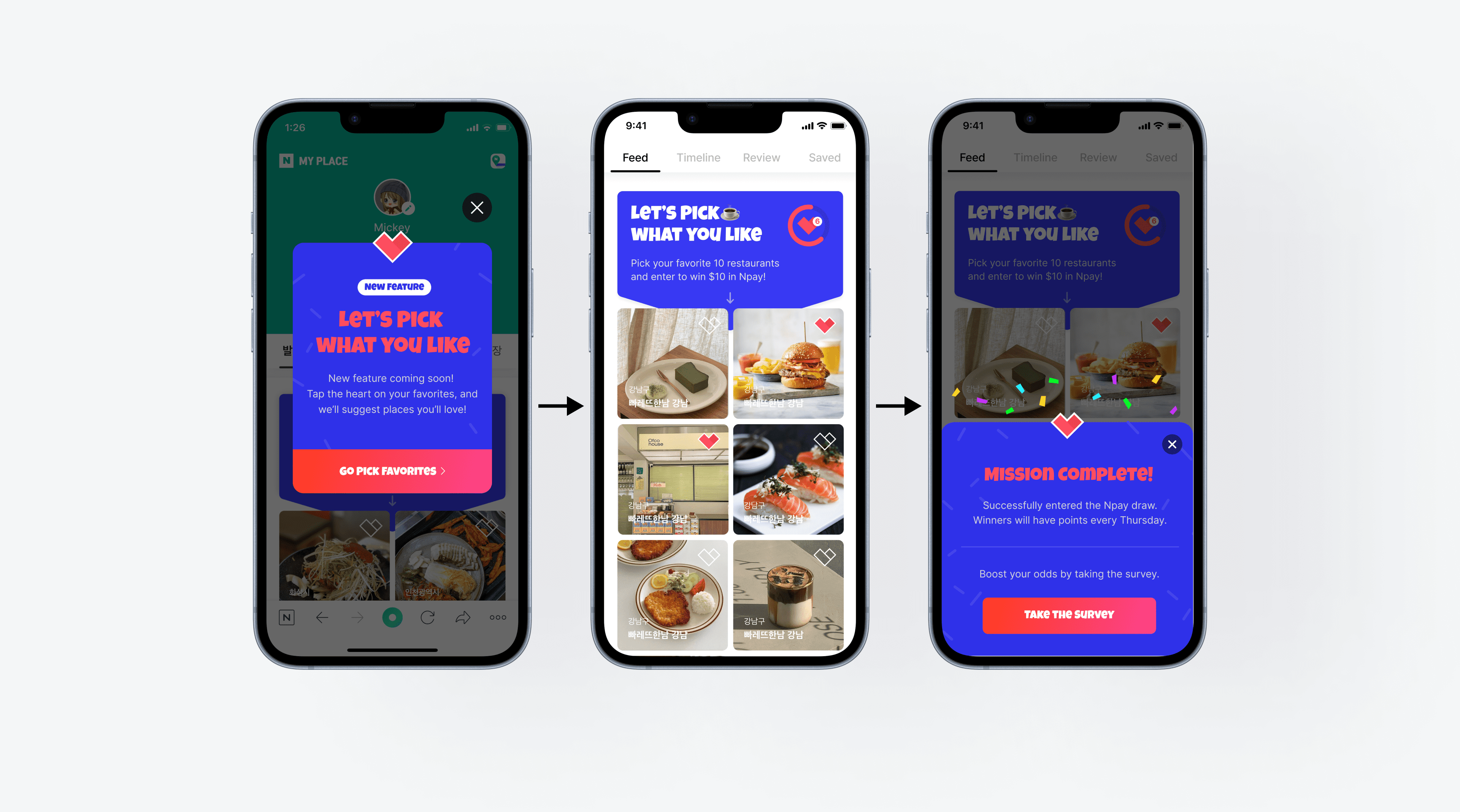
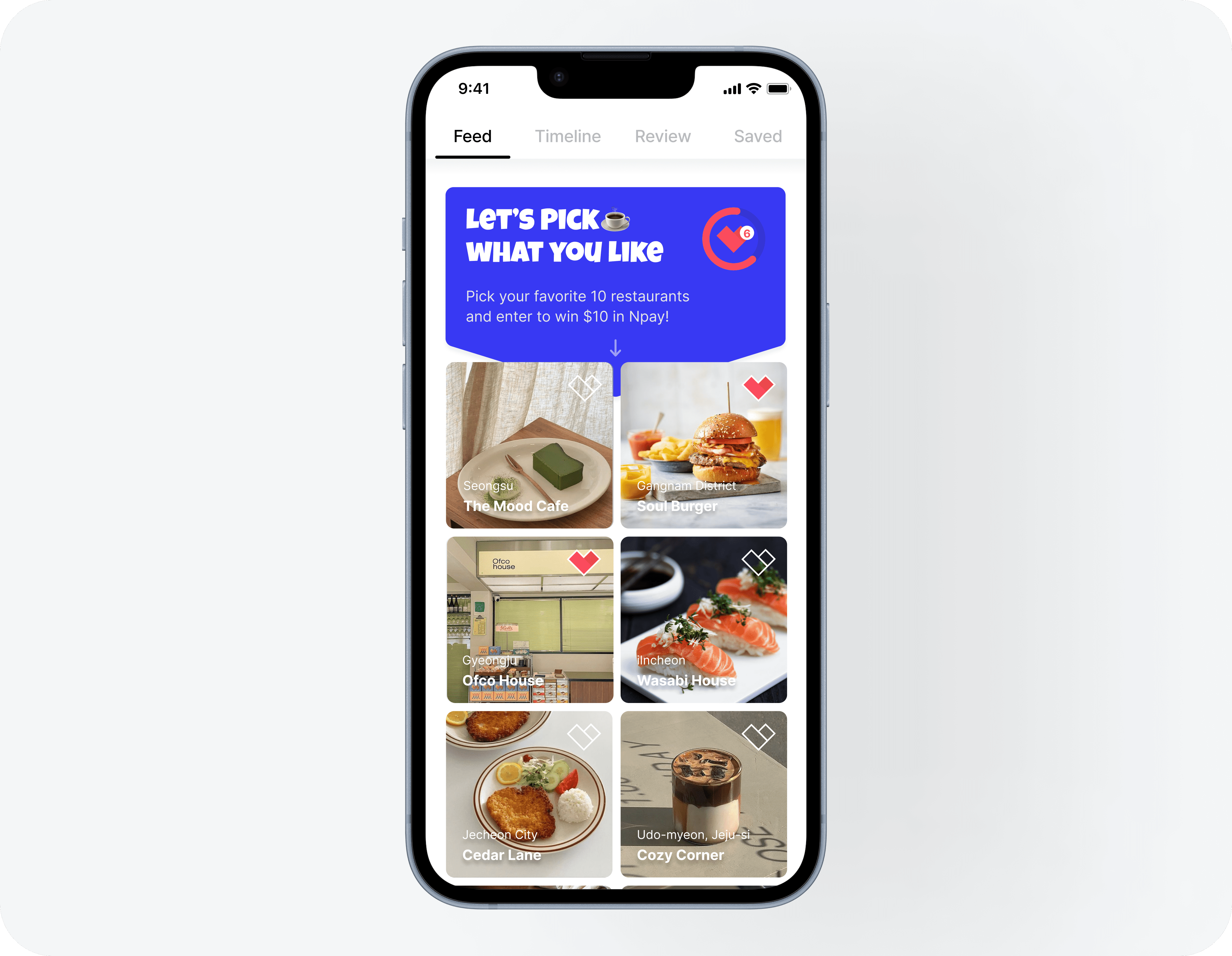
To boost user engagement, we organized an event where participants could earn redeemable points by selecting their preferred locations.
Recognizing that selections based on photos might not be entirely accurate, we decided to limit the required number of selections to ten. This approach ensures the recommendations are more precise and prevents users from having to later remove unsuitable choices.
We used a progress bar to show how many locations users had selected and how many more were needed. The process was designed to be flexible, allowing users to pause and resume at any time.
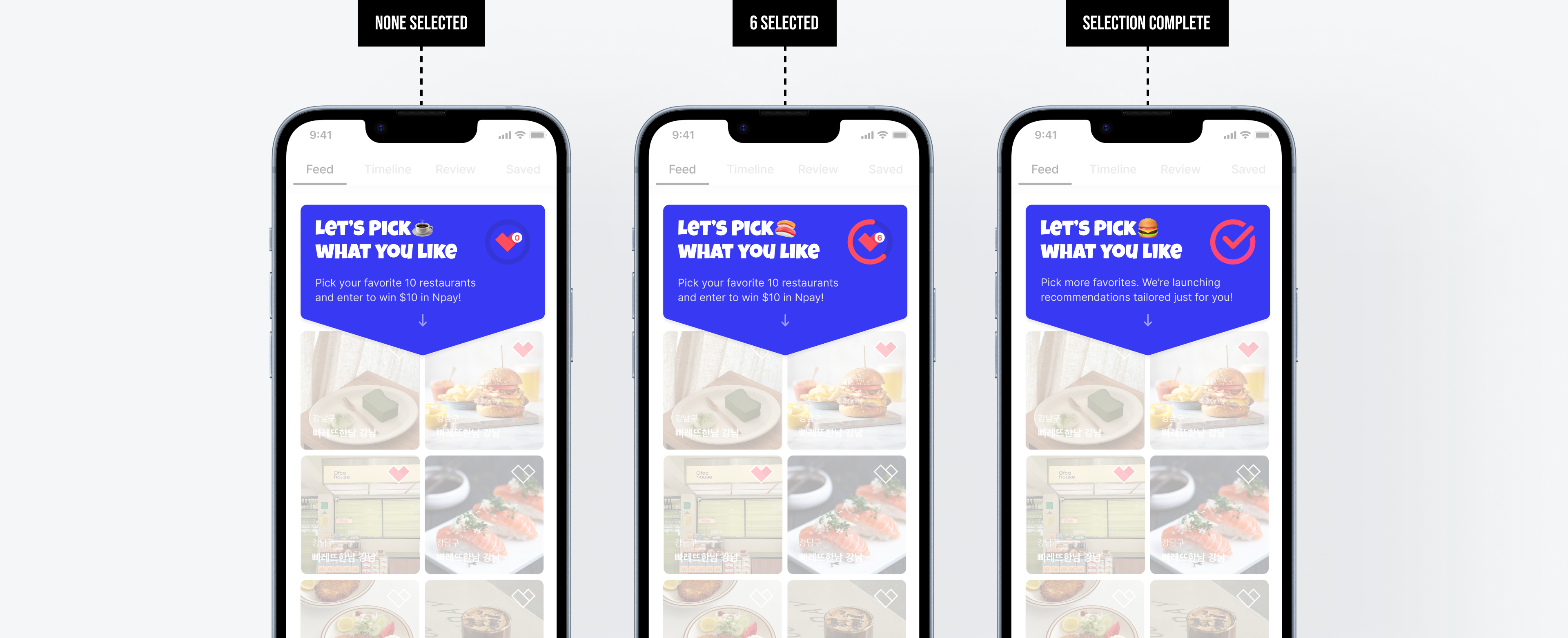
Users can easily track their progress as they select their favorite restaurants,
with clear indicators for selections made and the steps remaining.
We encouraged users who completed the mission to participate in a survey, offering them a higher chance of winning.
The survey focused on their experience selecting preferences, what they would like to receive recommendations for, and any shortcomings they noticed in other restaurant discovery services. These responses were planned to be used for improving the preference-based feed.
the launch
After internal testing, I continued to design and build the user experience, launching the feature in December 2021. Through surveys, we gathered a variety of user feedback, which was instrumental in understanding and shaping the direction for personalized recommendations.
A month later, this space transformed into the preference-based feed I had envisioned. Recommendations were provided based on the locations users selected during the initial setup. If no information on preferred locations was available, survey feedback was used to offer relevant suggestions.
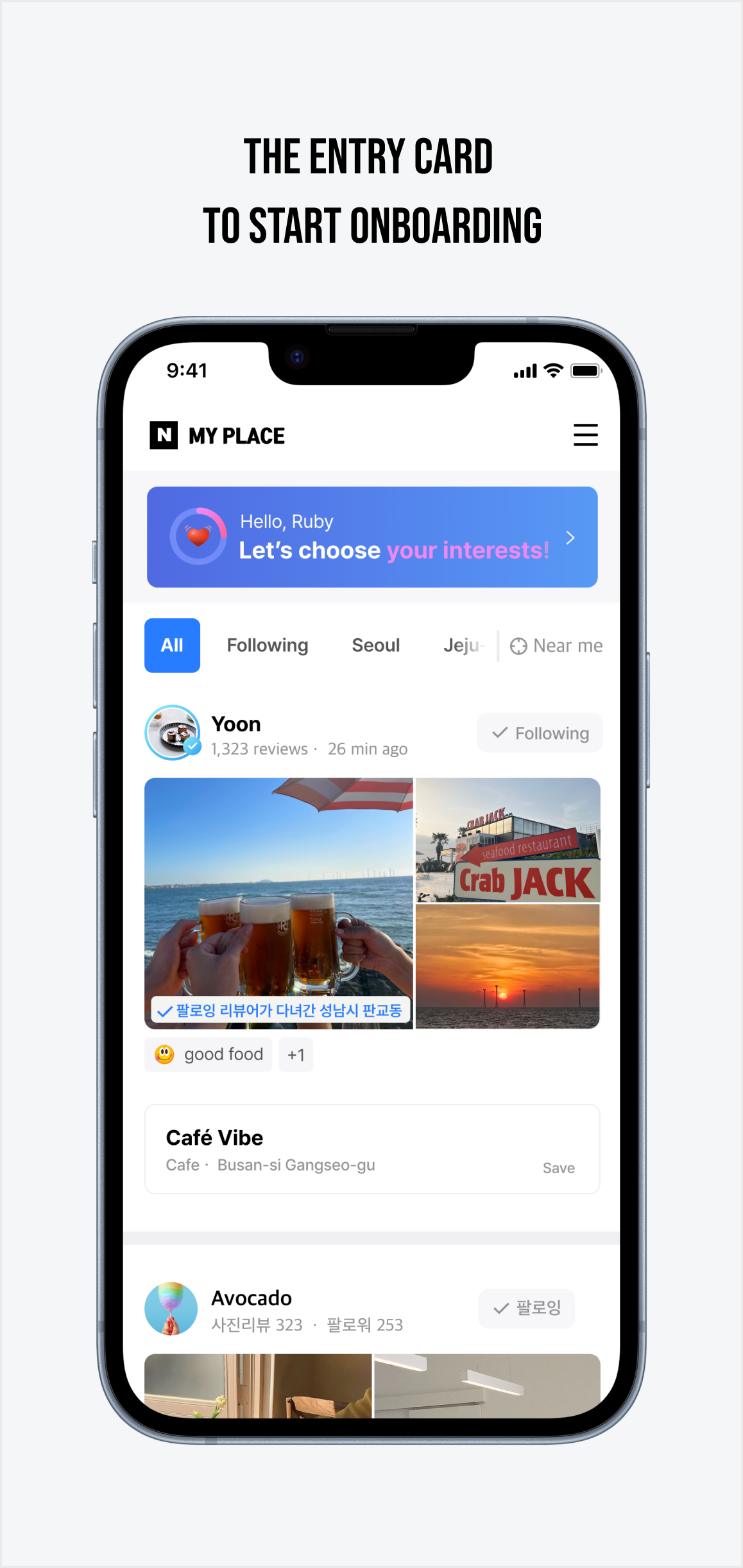
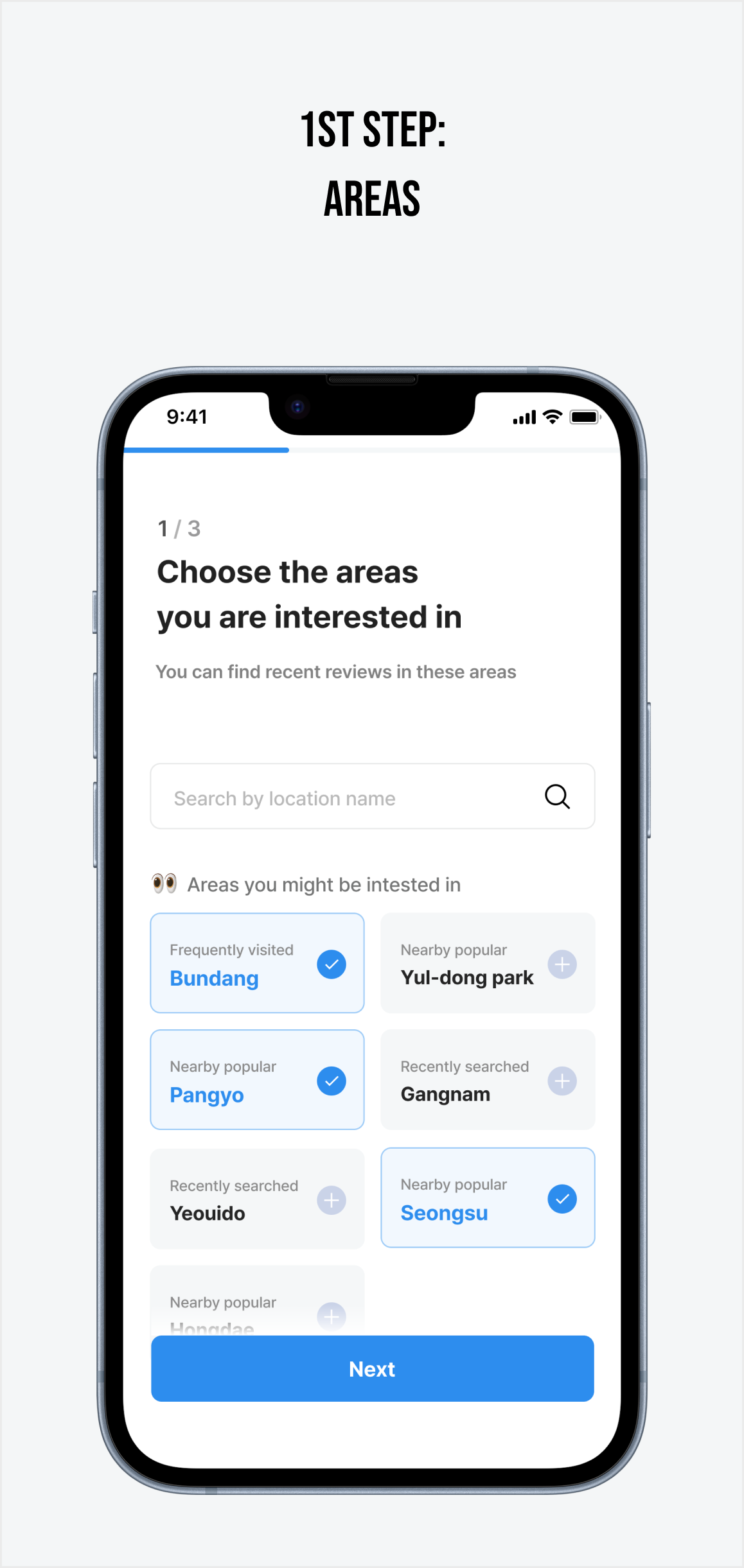
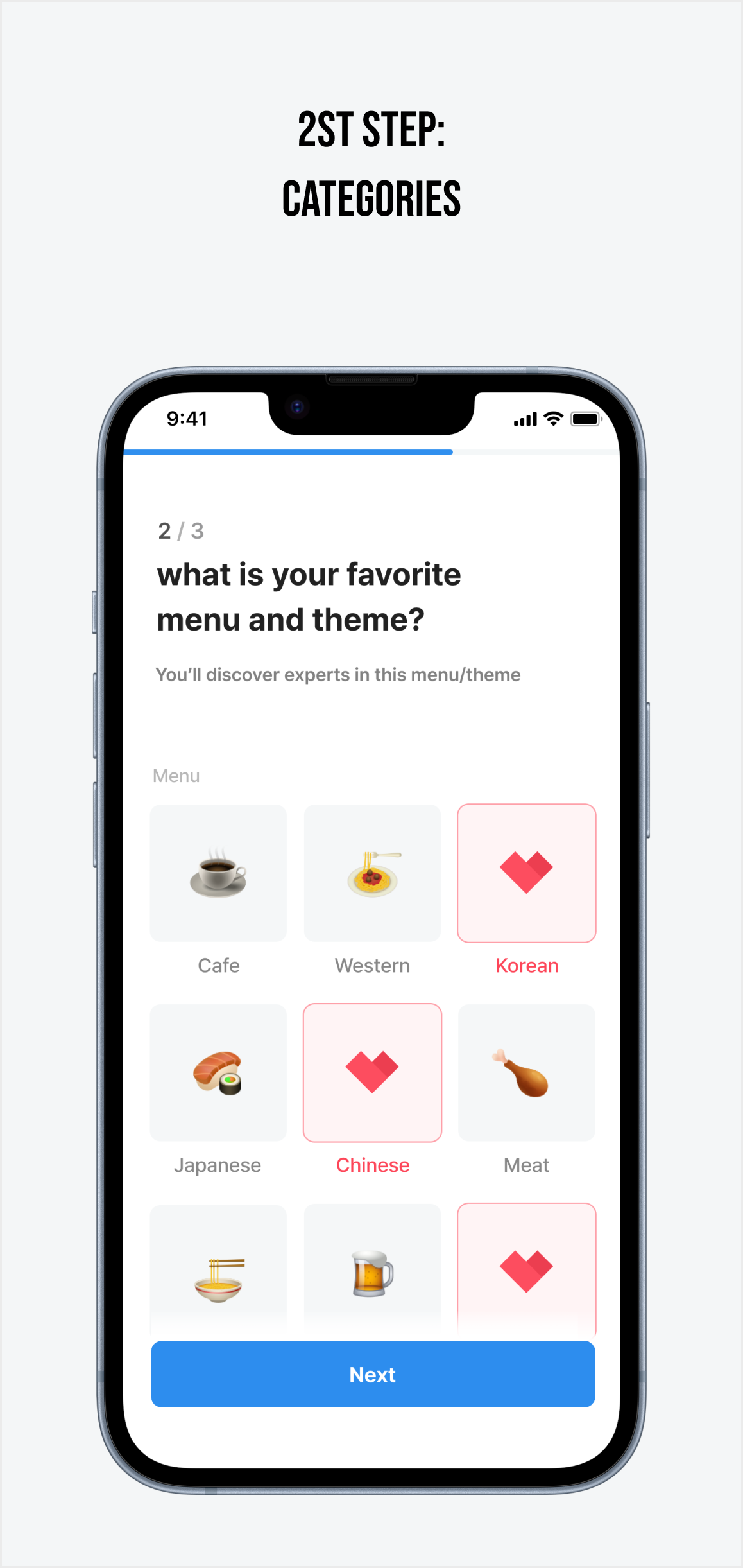
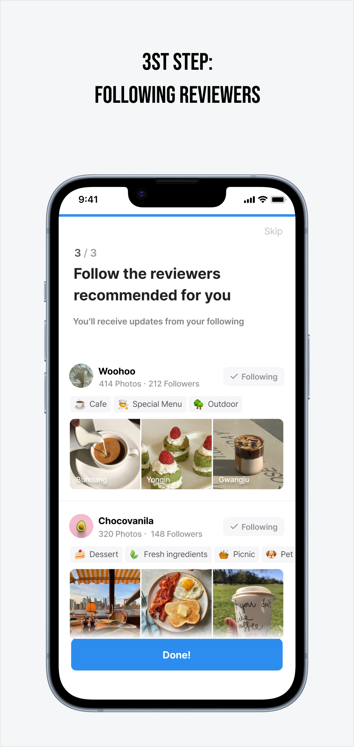
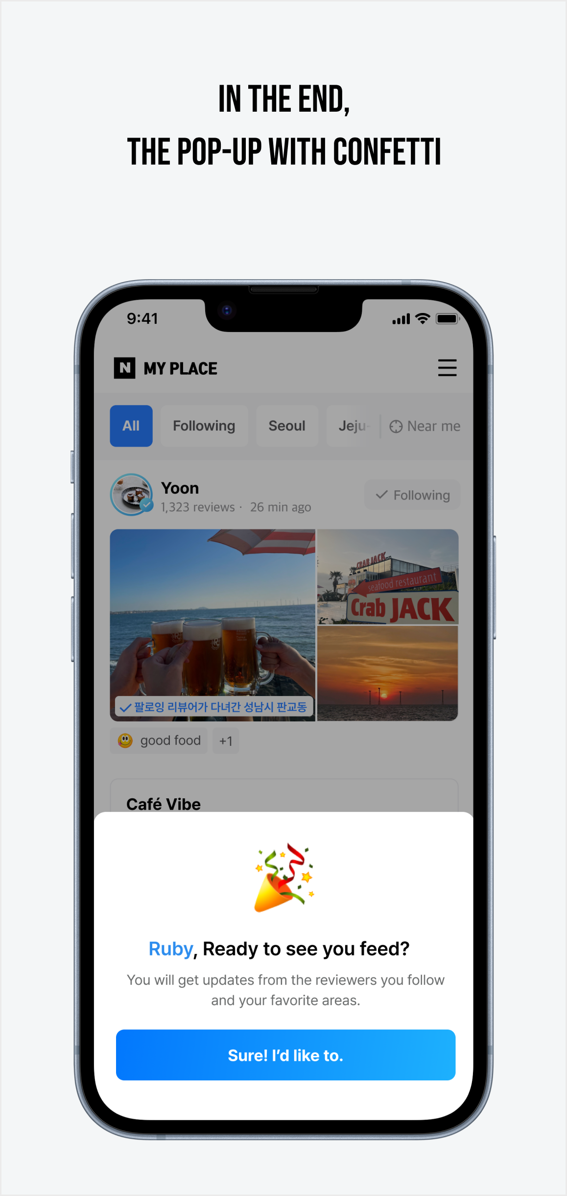
User history is collected through various routes to gather preferences.
impact
Secured 8 million preference data entries over one month
Collected responses from 40,000 survey participants,
aiding strategic direction
Traffic increased by 22% during the project period
Reflections
Smart Data Differentiation
Needed to Refine Accuracy
The project gathered valuable preference data, but it raised concerns about accurately categorizing preferences based on photos versus actual visits. To improve our recommendation model, I suggested weighting data differently—higher for visited places and lower for those chosen from photos.
We also identified issues with repetitive or less relevant recommendations. To fix this, we refined the model and committed to ongoing improvements for more accurate results.
Selected Works
Social Investing Journey2021.10-2023.12
Preference-Driven Feed2020.01-2021.01
Choose Your Tastes2020.11-2021.01
